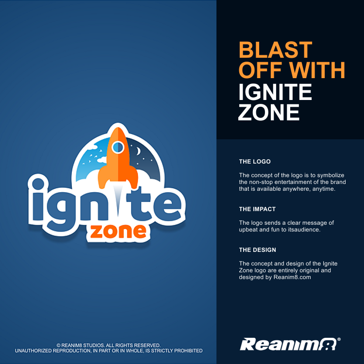
Logo Design for Ignite Zone
Client
Ignite Zone
Category
Logo Design
Client's Vision
The client wanted a youthful brand logo design for their new and fast-growing eSports establishment that opens around the clock. The initial idea suggested by the client was to have a Super Mario character standing behind their business name.
Our Concept
The eSports industry mainly caters for a demographic audience that is made up of teens and adults, whereas the Super Mario character is originated from a Nintendo game designed for a younger age group.
Due to this conflict, we were able to convince the client to ditch the Super Mario character. The goal was to create a logo design that delivers the meaning of non-stop fun and excitement for the client’s brand.
In order to achieve this, we came up with the idea of a rocket blasting off from their brand name. The rocket’s fire trail would represent the letter ‘i’ in the word, Ignite. The day and night cycles behind the rocket represent the client’s 24/7 business availability.
The colors used in the logo design are shades of blue and orange for their subliminal psychological reasons. Blue represents the client’s business as dependable and trustworthy. Orange represents fun and excitement, and is associated with the younger generation.


